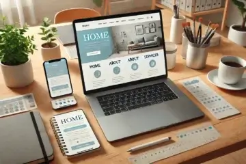
Attention web wanderers! Are you tired of feeling like you need a GPS just to explore a website? You’re not alone. In today’s digital landscape, user-friendly navigation isn’t just a nicety—it’s a necessity. Whether you’re a tech-savvy designer or a business owner diving into the world of web development, mastering the art of intuitive navigation is key to keeping visitors engaged. So, if you’re ready to transform frustration into satisfaction and confusion into clarity, buckle up! This article is your ticket to crafting navigation that ensures every click feels like a breeze.
Welcome aboard the navigation express! Today, we’re embarking on a journey to demystify the art of user-friendly website navigation. So grab your virtual compass and get ready to navigate the digital maze like a pro.
First stop: Understanding the User. Picture yourself as a traveler exploring a foreign city. What’s the first thing you look for? Signs, landmarks, anything to guide your way. The same goes for website visitors—they crave clear signposts and intuitive pathways to help them reach their destination. That’s why understanding your audience’s needs and behaviors is the cornerstone of effective navigation design.
Next up: Simplify, Simplify, Simplify. In the world of web design, less is often more. Complex menus and cluttered layouts can leave users feeling overwhelmed and eager to hit the back button. So, strip away the excess and focus on streamlining navigation to its bare essentials. Think of it as if a professional organizer is doing your website—keeping only what sparks joy (and clicks!).
Now, let’s talk about the power of Consistency. Imagine driving on a road where every intersection follows a different set of rules. Chaos, right? The same goes for website navigation. Consistency breeds familiarity, making it easier for users to predict where they’ll find the information they need. So, stick to a standardized menu structure and labeling conventions to keep visitors on the right path.
But what about Mobile Users? With more and more people browsing on smartphones and tablets, mobile-friendly navigation is non-negotiable. Opt for responsive design techniques that adapt your menu layout to fit smaller screens seamlessly. And don’t forget about touch-friendly elements—there’s nothing more frustrating than trying to tap a tiny link on a touchscreen.
Last but not least: Test, Iterate, Repeat. Rome wasn’t built in a day, and neither is the perfect website navigation. Embrace a mindset of continuous improvement by gathering feedback from real users and analyzing website analytics to identify pain points. Then, iterate on your design based on what works and what doesn’t. Remember, the journey to exceptional navigation is a marathon, not a sprint.
So there you have it, fellow web wanderers! By understanding your users, simplifying navigation, maintaining consistency, prioritizing mobile-friendliness, and embracing a mindset of continuous improvement, you’ll be well on your way to crafting navigation that delights users and drives results. Happy navigating!


0 Comments